MyCabin
Branding and product design to activate growth for an outdoor-hospitality start-up
MyCabin is a booking platform where outdoor adventurers can browse and discover beautiful spots to set up camp in nature. The start-up promotes soft tourism and boasts one of the largest selections of overnight tenting and camper van lots in Germany. No matter what you are looking for, MyCabin promises to bring you an unforgettable experience that connects people and the great outdoors.
An audit of the market segment revealed a lack of differentiation between MyCabin and its competition. An overly complex logo, undistinguished visual design and inconsistent communication throughout the user journey lead to a fragmented, disjointed user experience.
Overview of old design and the competitive landscape
Brand strategy
From underdog to pack leader for the masses
We helped the team at MyCabin formulate a clear and concise brand position that customers can relate to, broadening its communication strategy to speak to the masses. Along with a new brand promise, we set our sights on growing the start-up from an underdog to leader of the outdoor hospitality market.
Based on the new positioning, personality and competitive landscape, our challenge was to create a strong, differentiating and memorable brand experience consisting of a new visual and verbal identity.
Visual identity
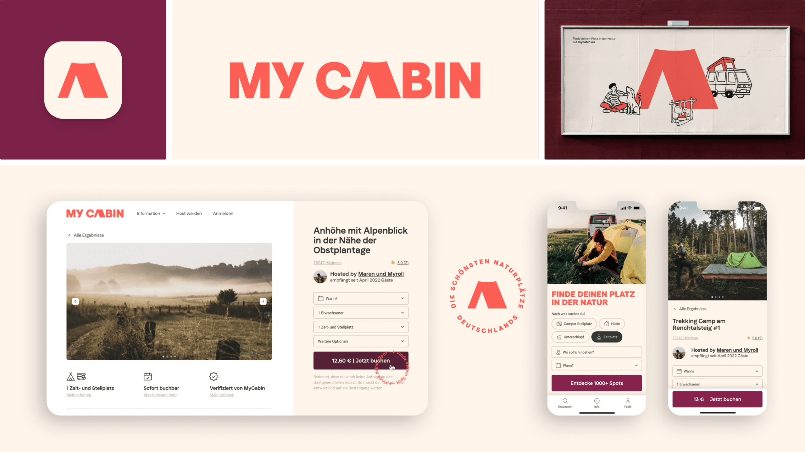
We created an expressive, curious, playful visual identity to capture the positive, earnest, lighthearted nature of the new brand. From logo to typography, from colour to imagery, we crafted each visual component of the identity to elicit a consistently optimistic, uplifting feeling.
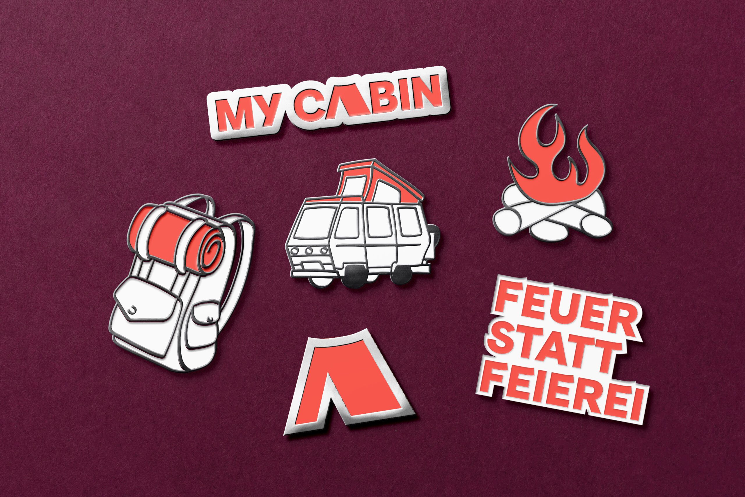
The logotype is based on the typeface Faro from Luzitype (2021). The variable font features a mood axis, which allows for horizontal strokes within glyphs to gently curve upwards to mimic a smile. Along with other formal optimisations, we modified the A glyph into a tent symbol to create a simple logotype that is easy to recognise, and alludes to the brands’ core offering.
Inspired by outdoor adventures, the colour palette is warm, lively and visually impactful. They work together with typography and imagery to communicate a sense of adventure, movement and activity.
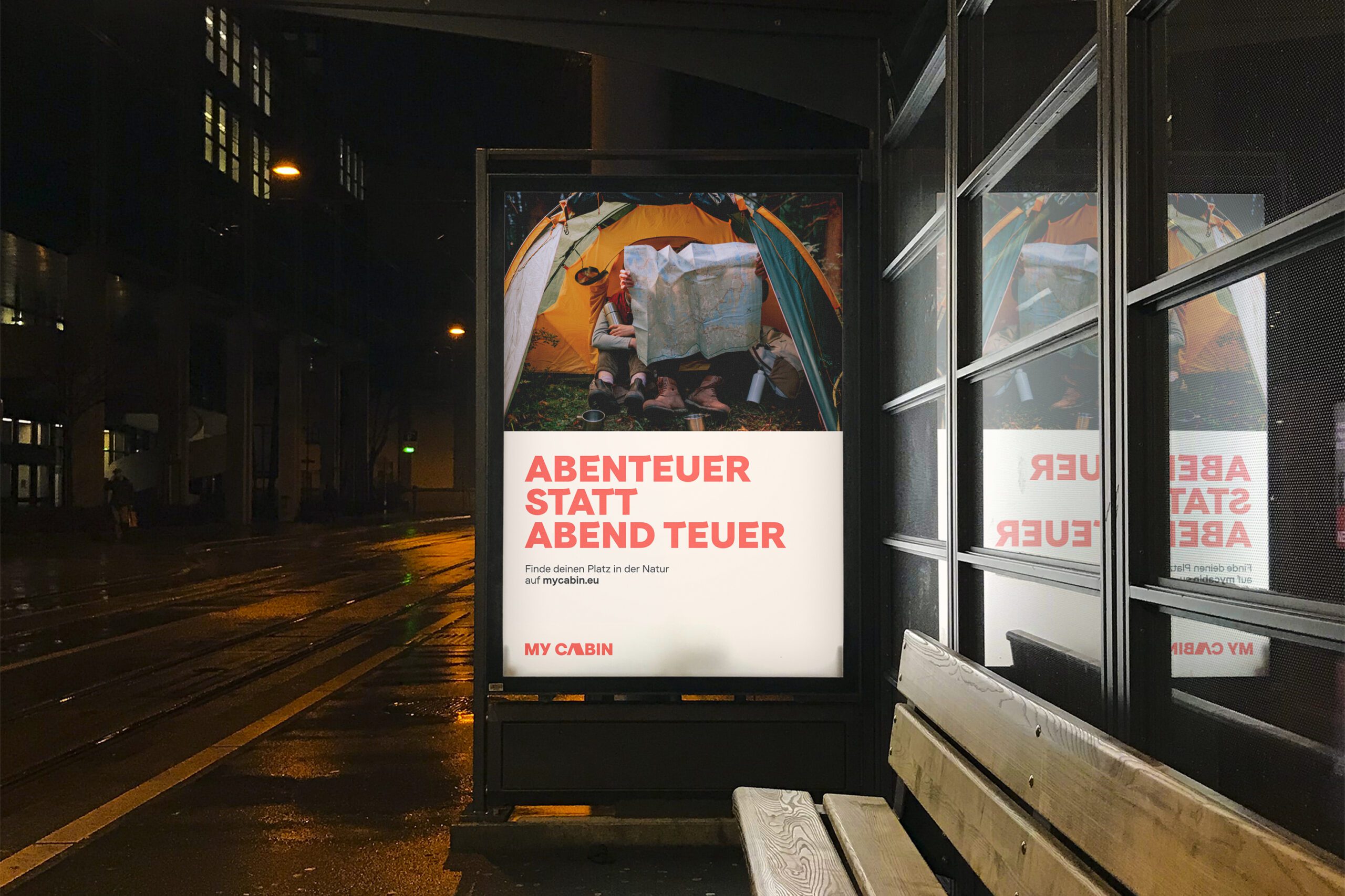
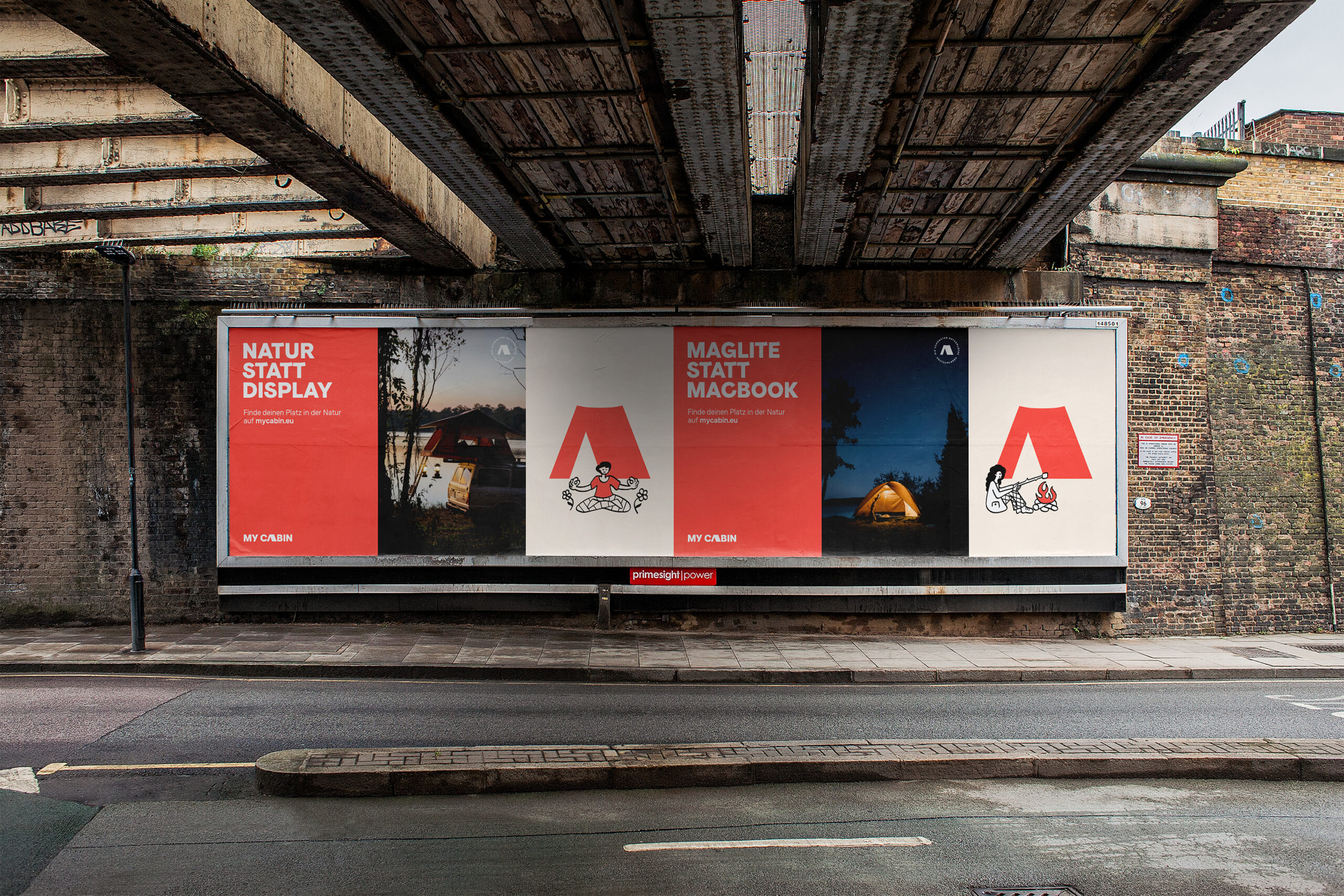
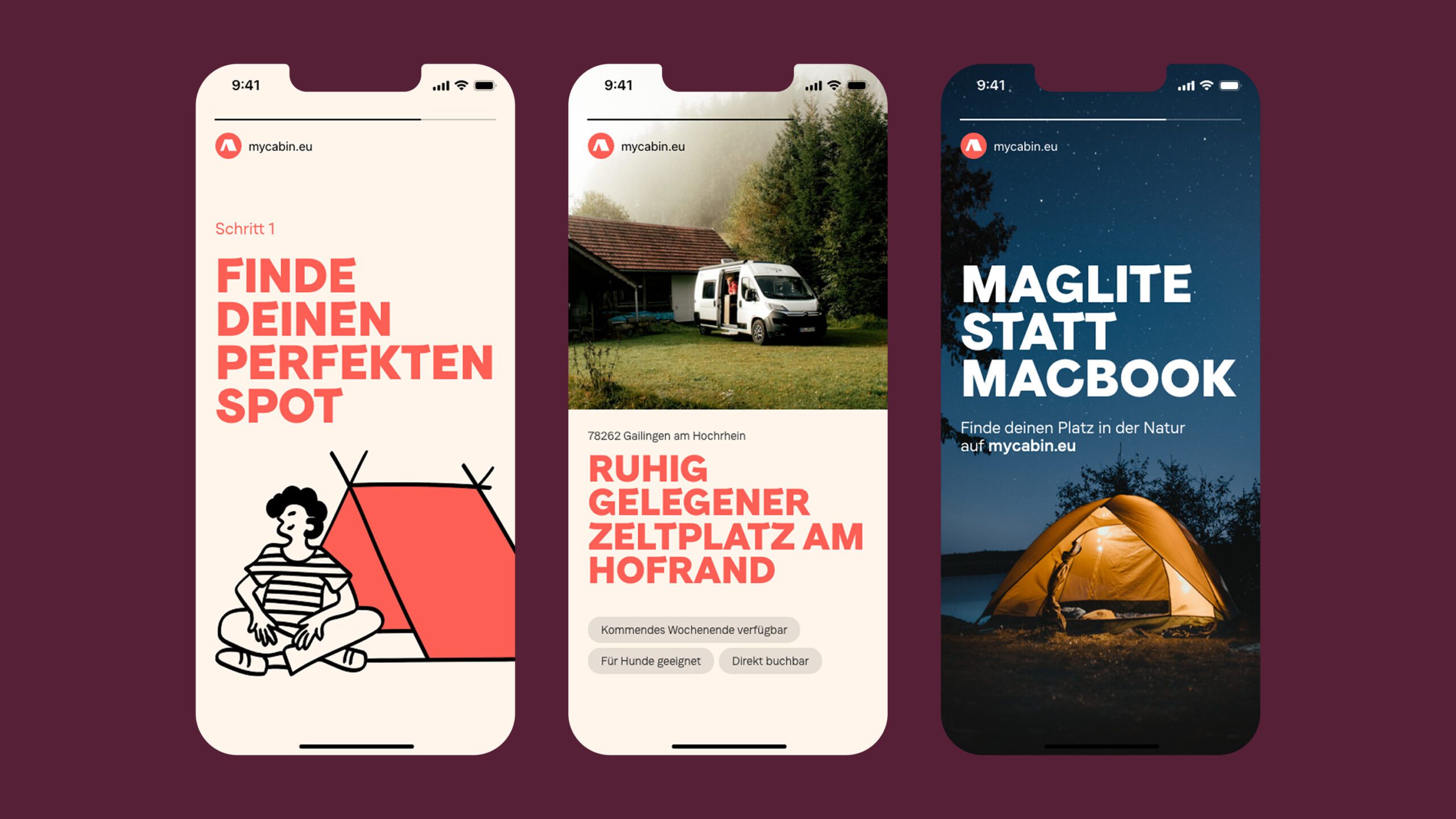
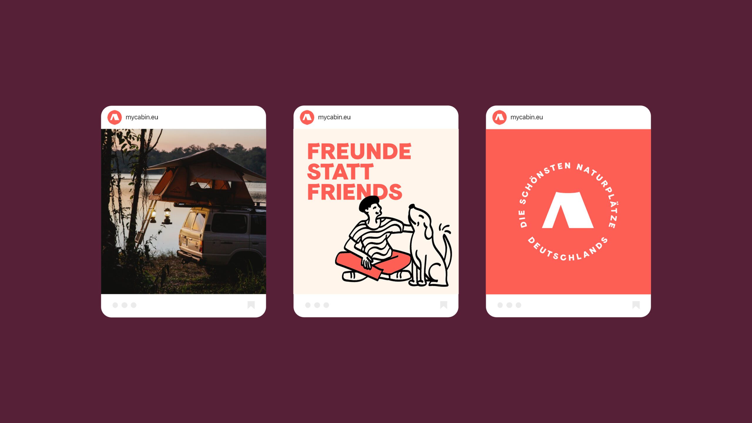
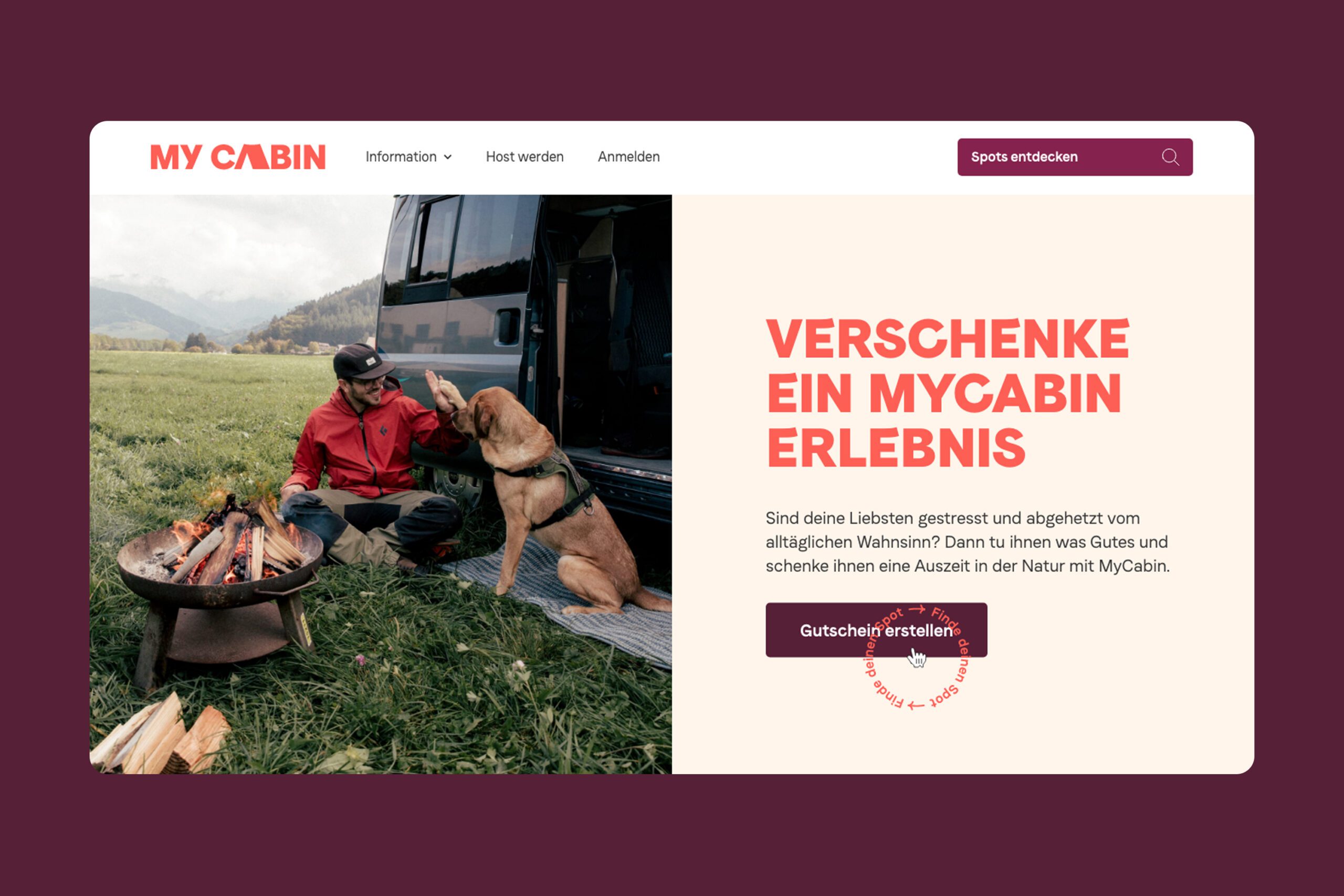
We crafted a set of Lightroom presets to achieve a consistent, uniform visual style. Whether it is portraiture or nature, imagery capturing authentic moments of people in nature convey a feeling of “I would like to be there too”.
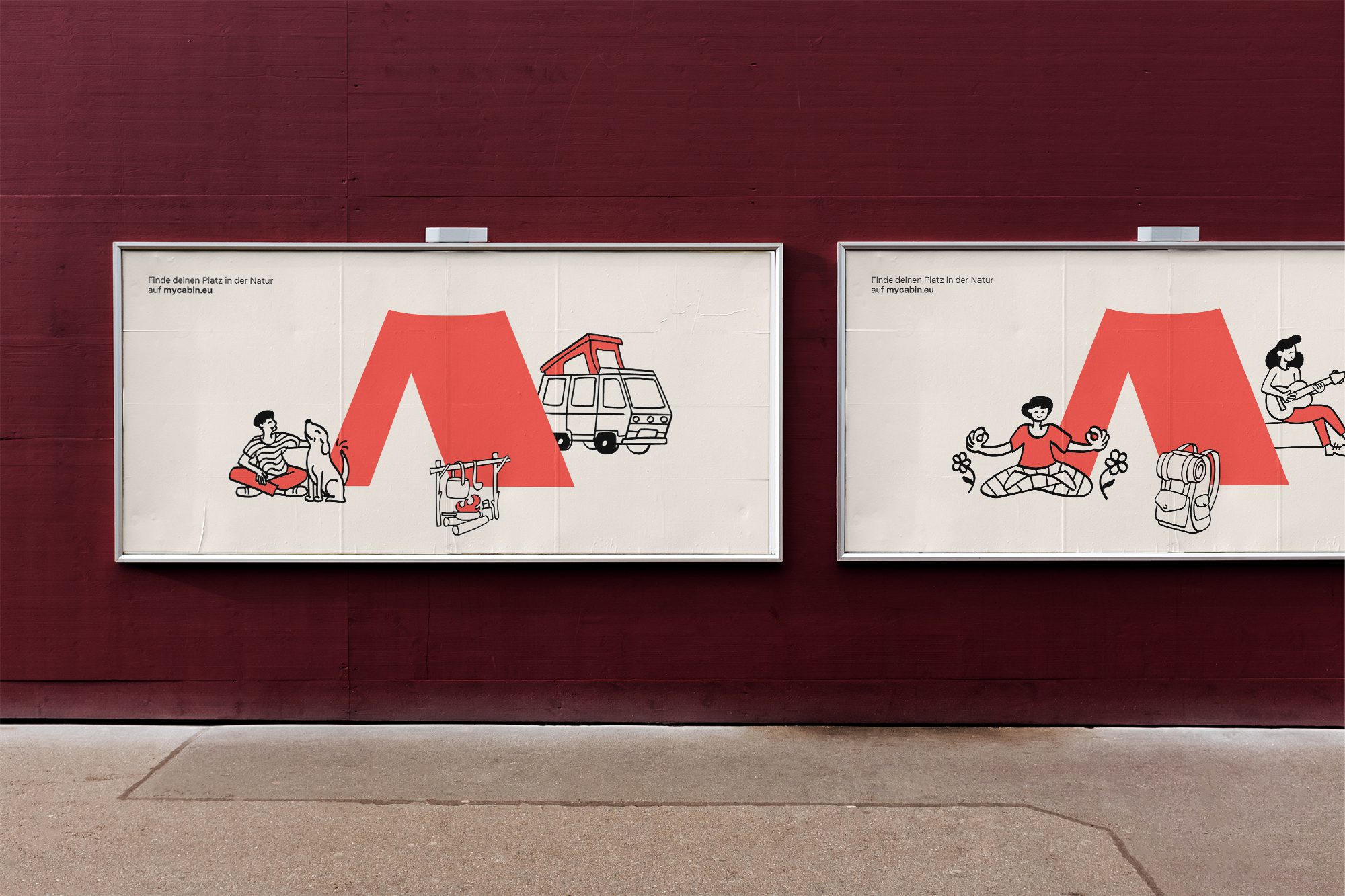
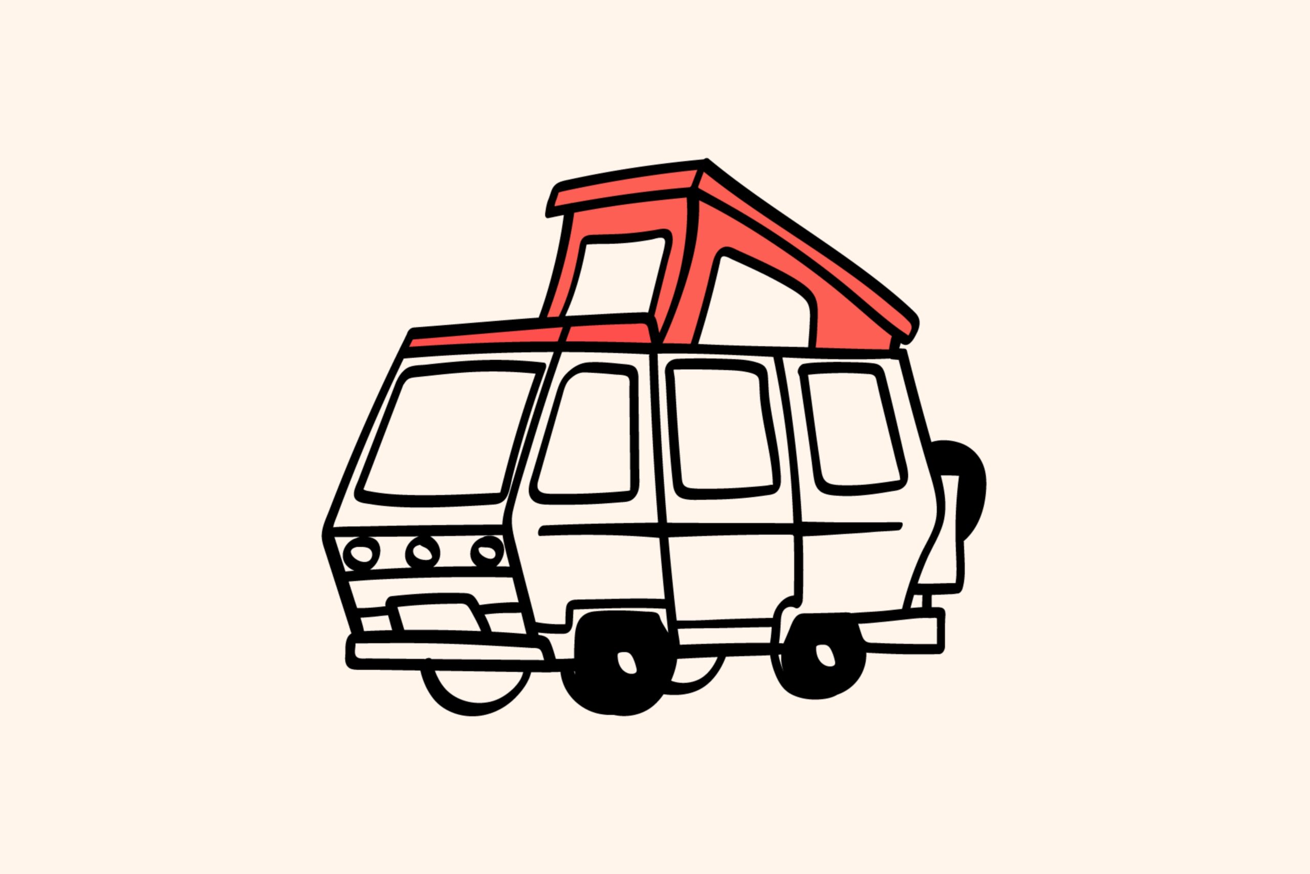
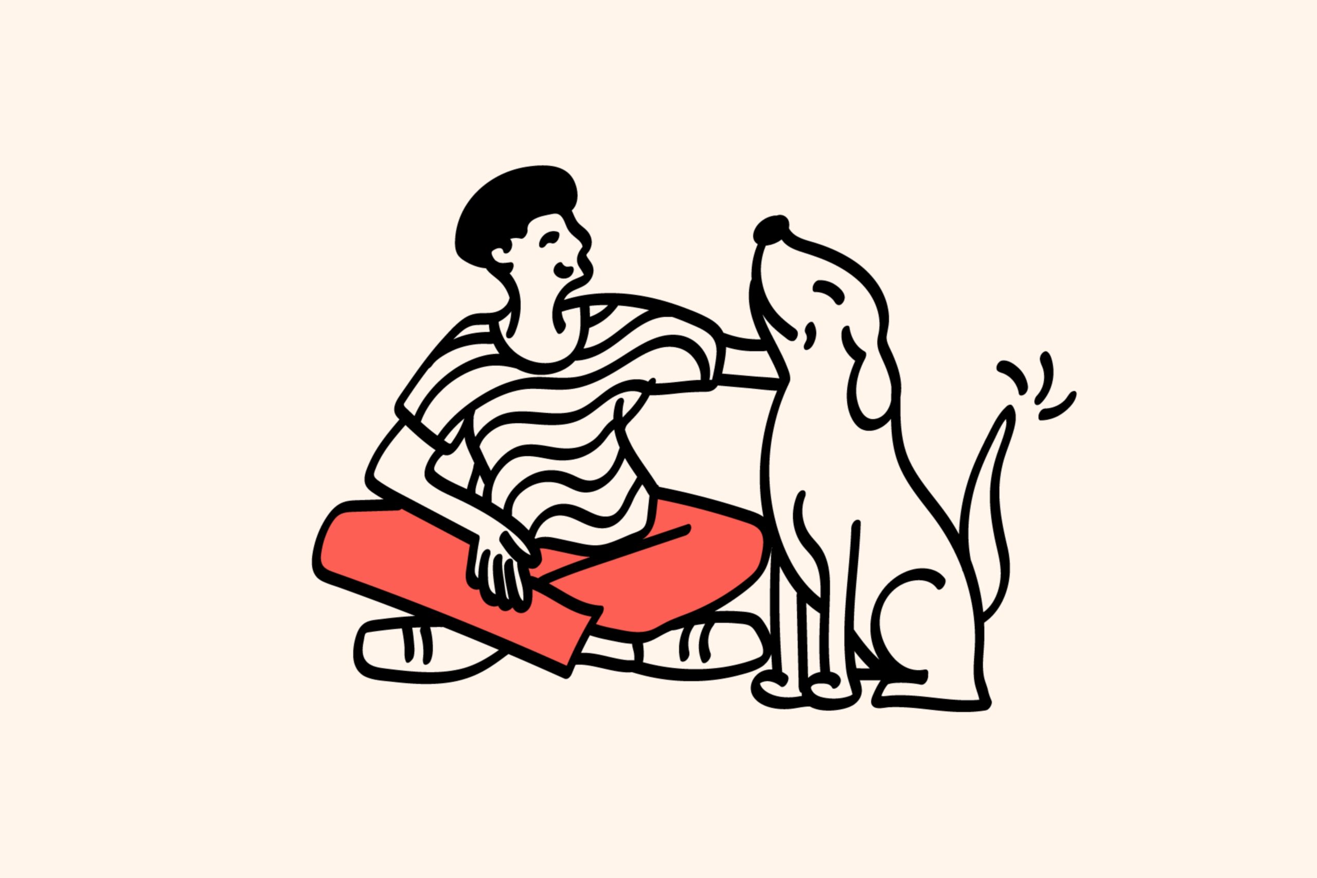
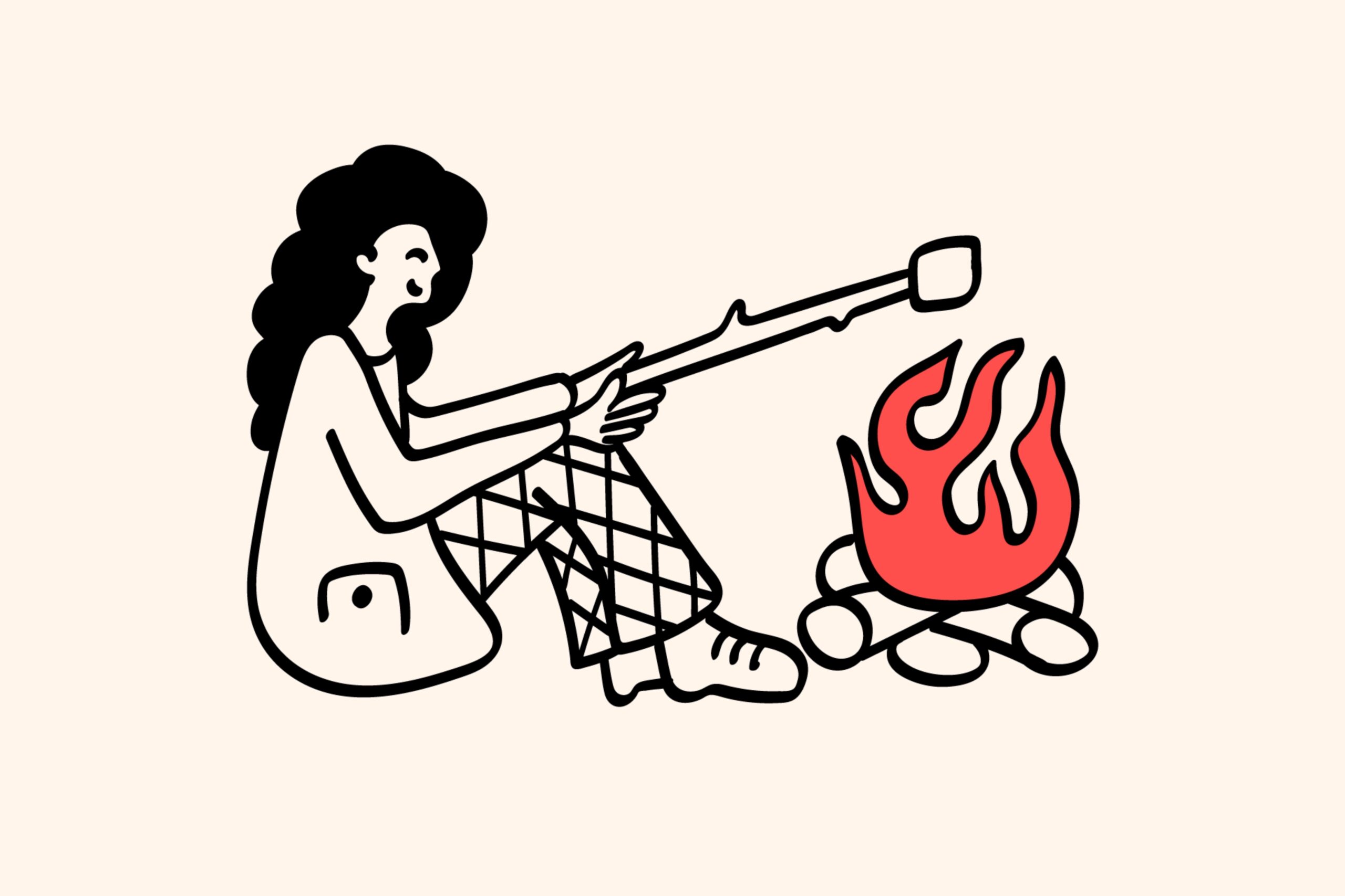
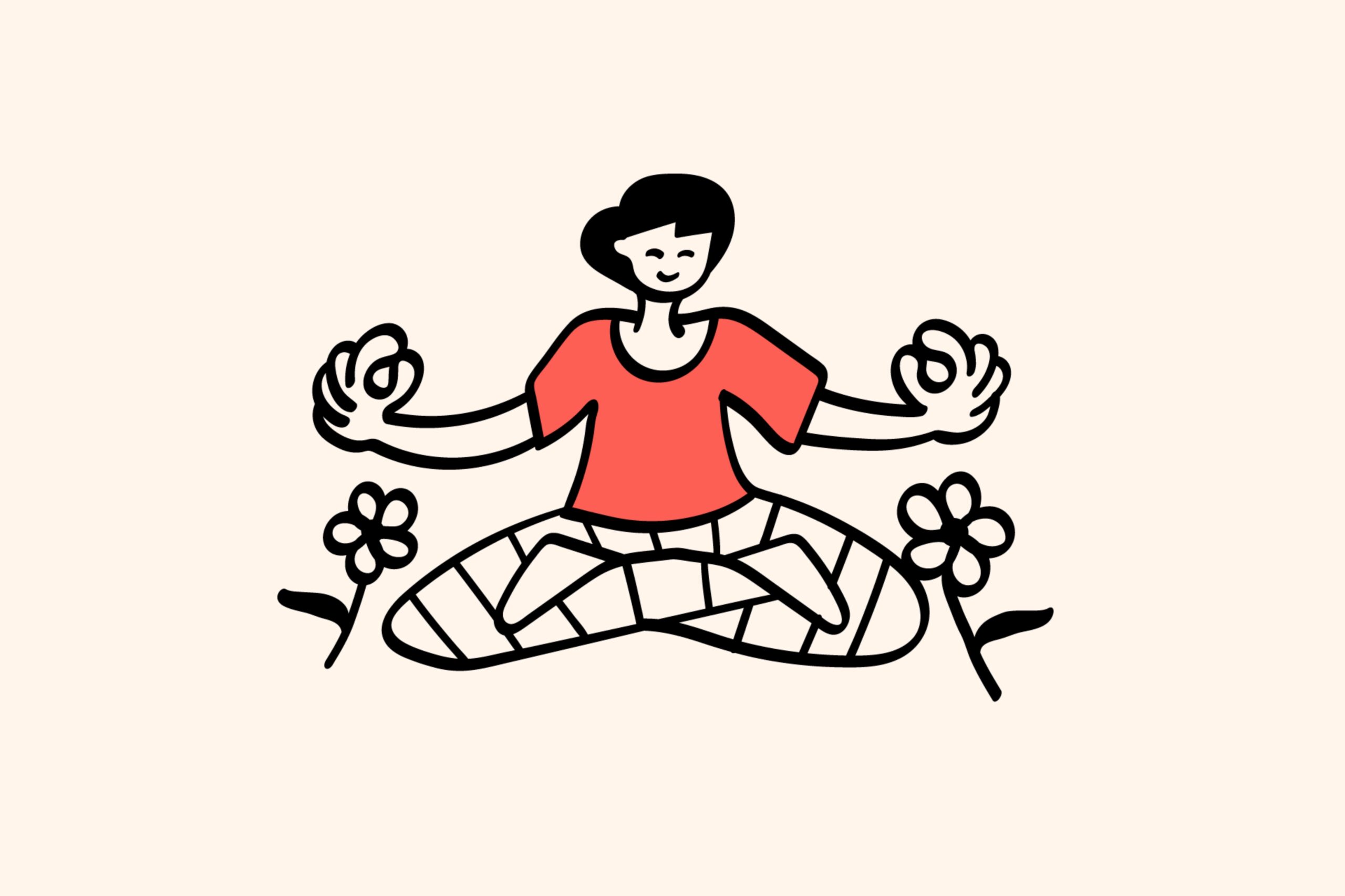
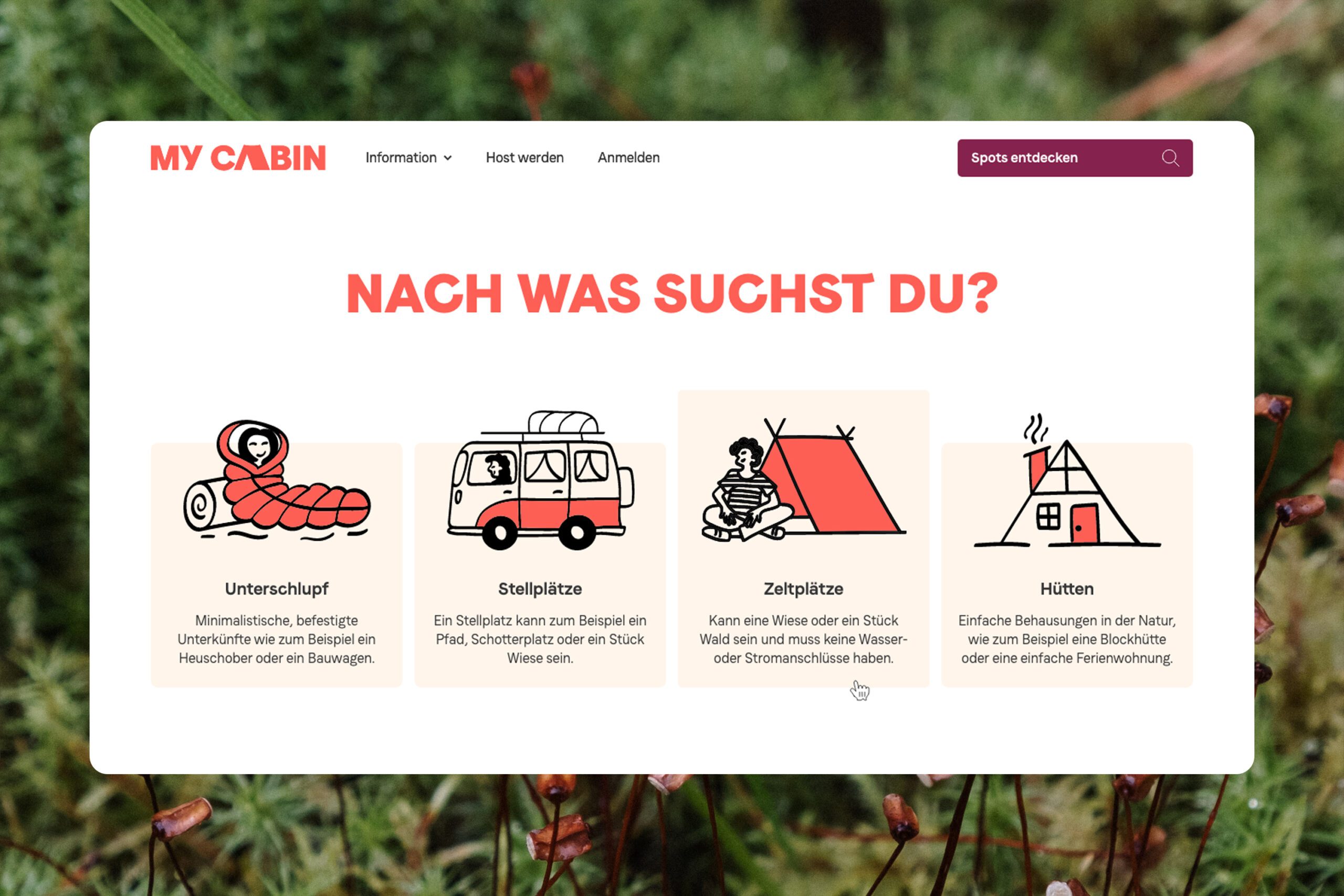
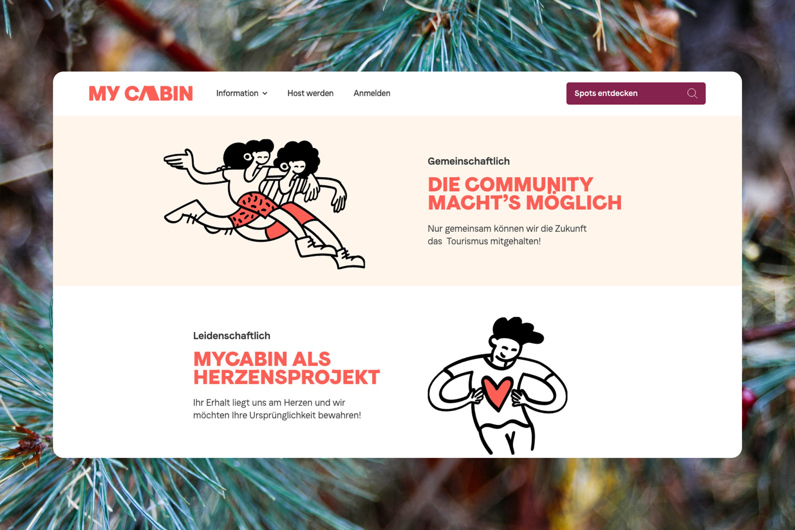
To inject a sense of spontaneity and imperfection, we also introduced a set of hand-crafted illustrations to the mix. Characterised by organic brushstrokes, they capture the small, joyful moments of the ideal outdoor experience.
Brand experience
Optimised digital experience from booking to hosting
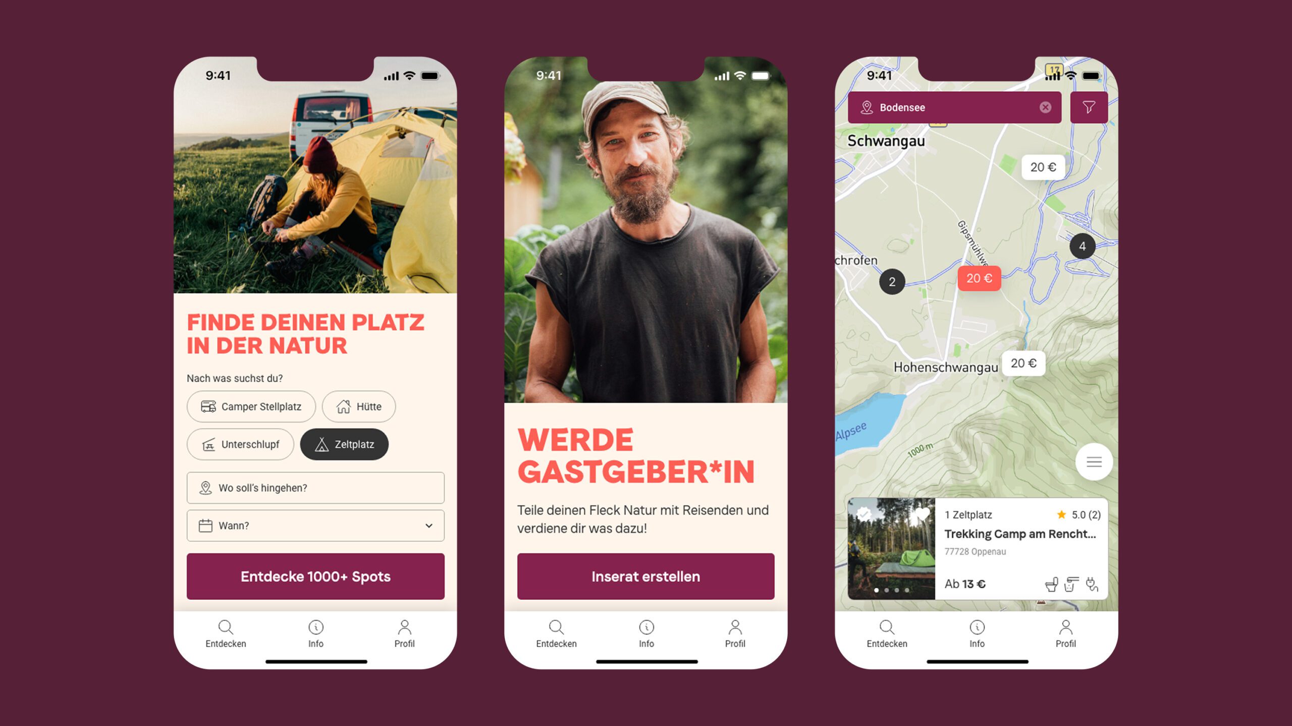
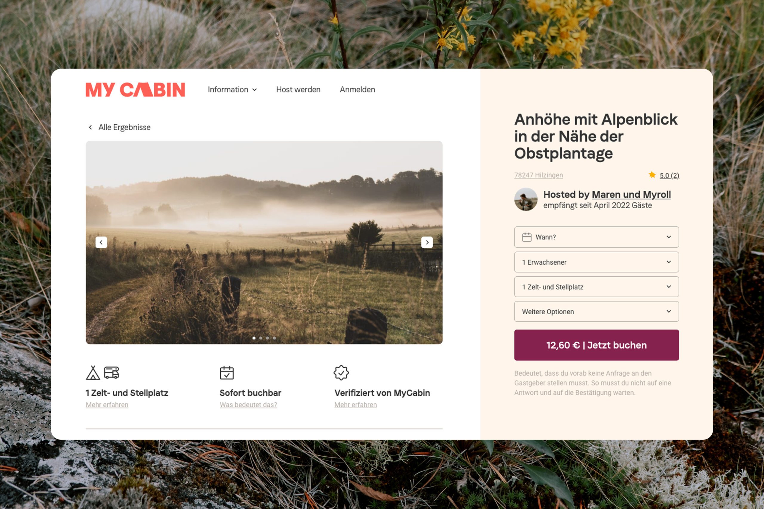
When it came time to apply the new visual identity to MyCabin’s core product, the website, we wanted to do more than just beautifying the interface. We analysed the journey both hosts and customers undertook, and suggested optimisations to the user-experience to create a smoother, more intuitive sign-up and check-out process.
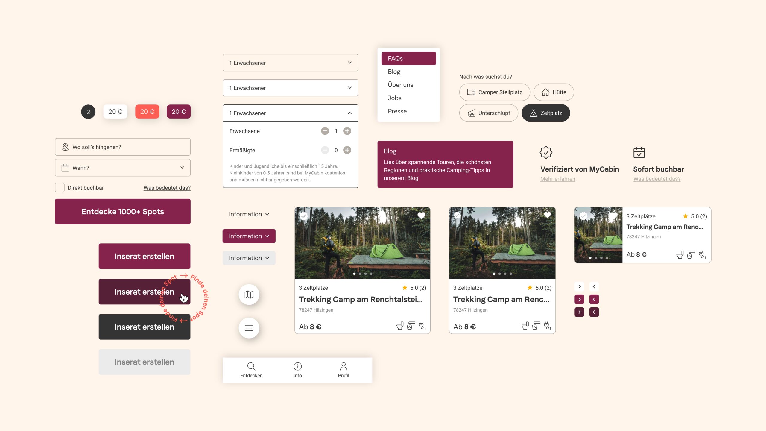
Only then did we begin building a robust and functional design system that closely reflected the new brand identity. The in-house developers brought our collective vision to life using the component library, key screens, and documentation we handed over at the end of this process.

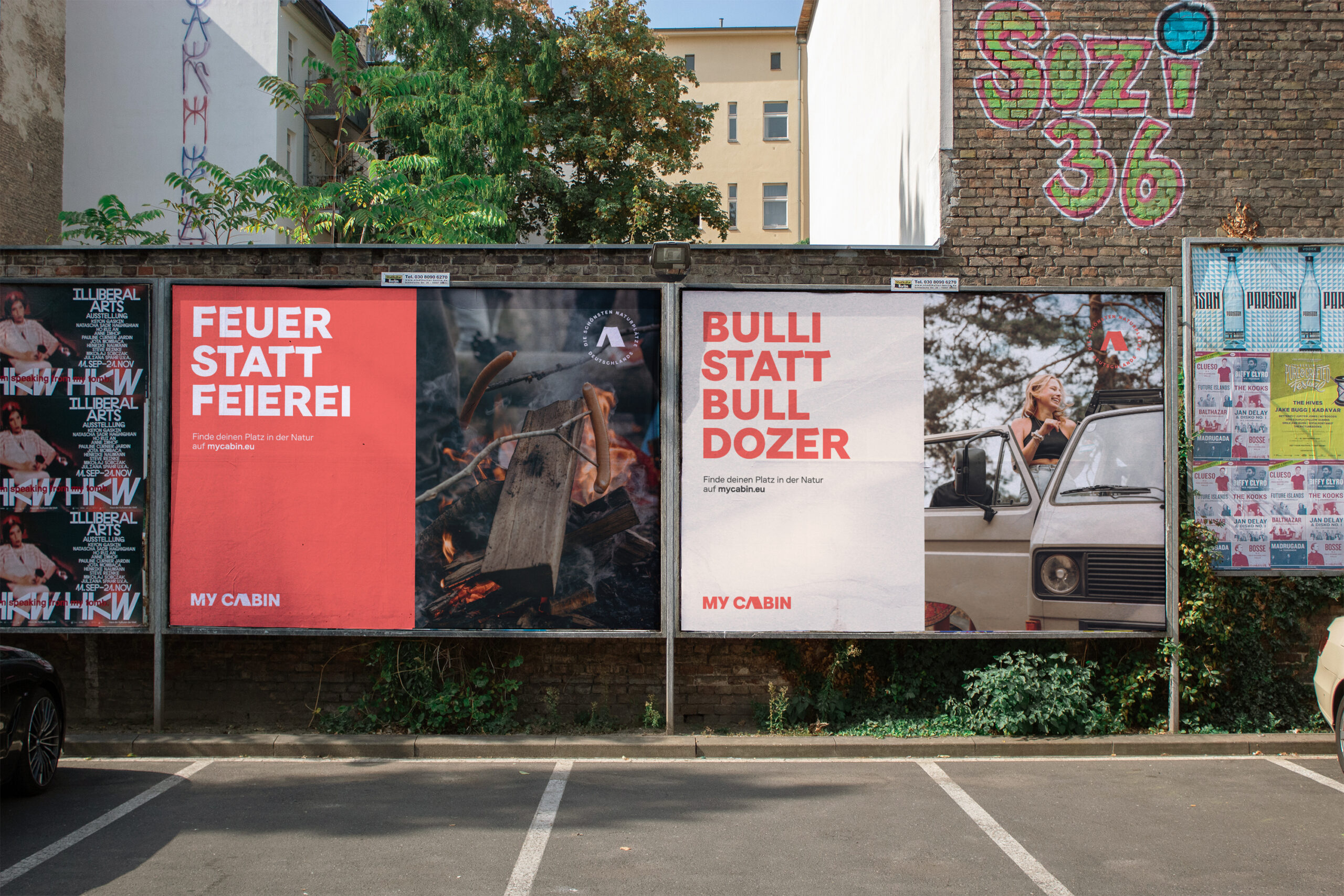
Where else but everywhere?
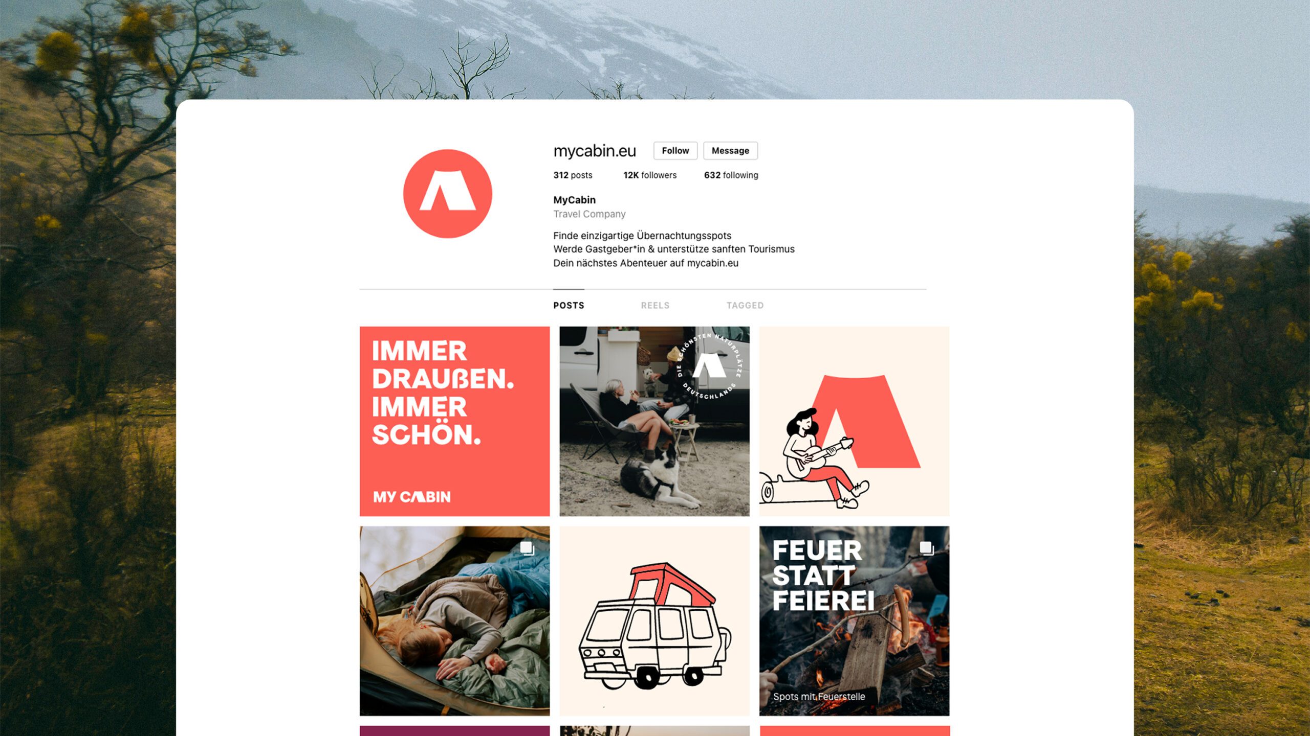
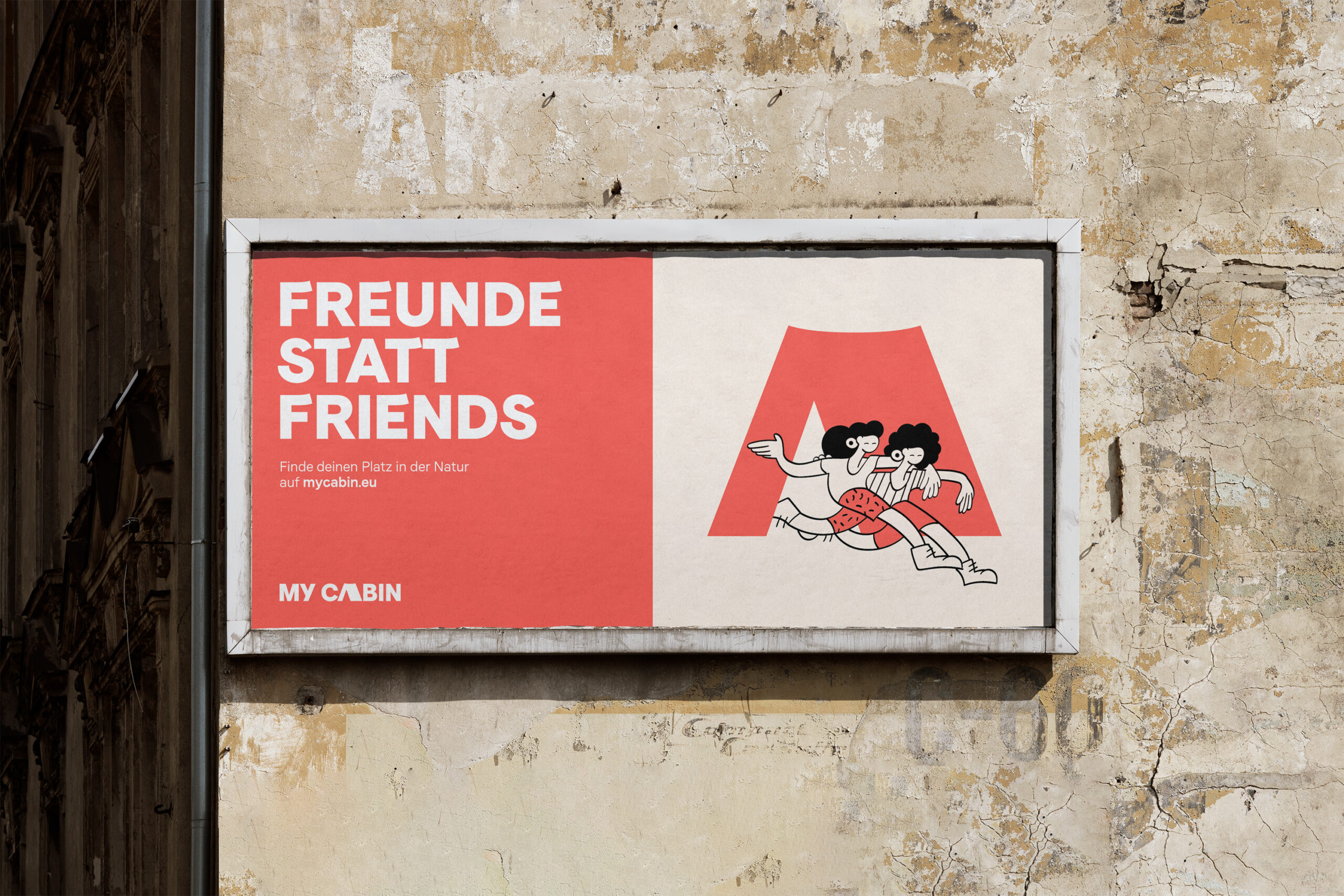
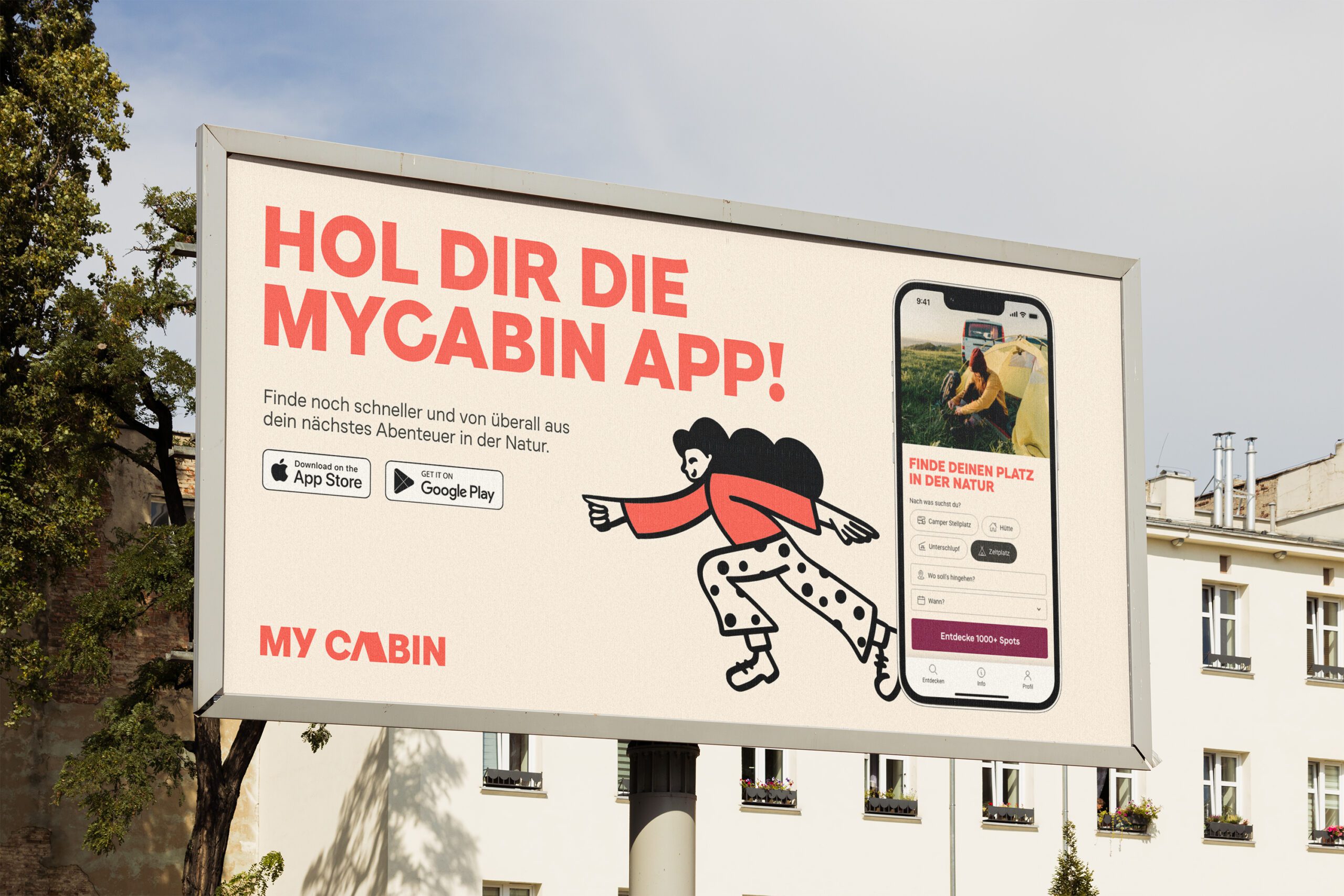
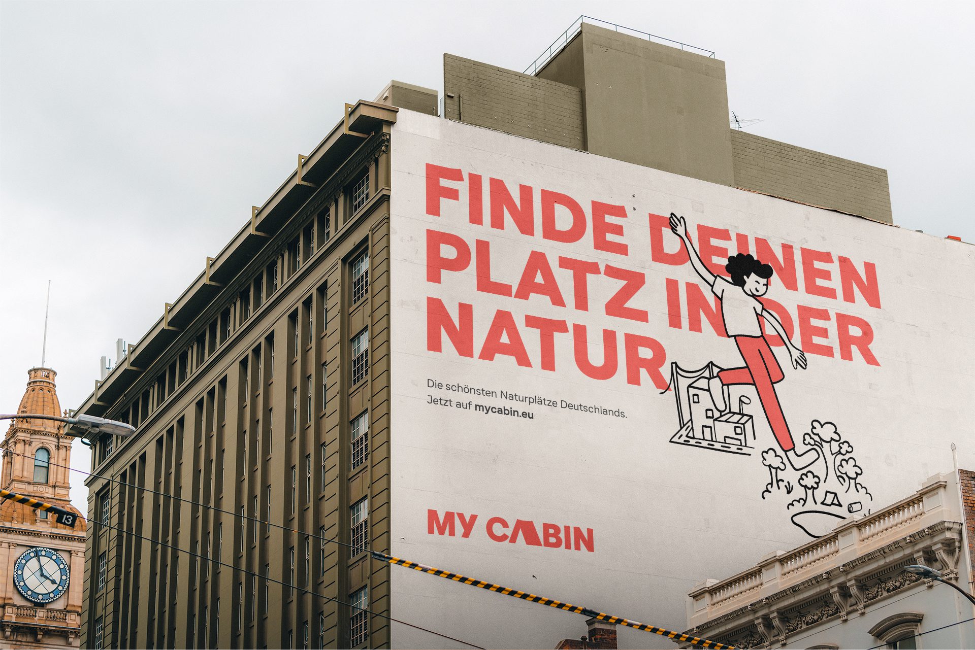
The brand is also more approachable and expressive when it comes to outdoor advertising and social media. Identity elements such as type, imagery and illustrations can be combined freely based on media and format. A pun-filled copywriting mechanic adapts to different target groups and motivates people to step away from the busy urban life, and instead imagine spending time with friends surrounded by nature.
